Publication: Sep 13, 2025
Conversion Rate Optimization for Paywalls: Turning Walls into Doors
Conversion Rate Optimization for Paywalls: Turning Walls into Doors
Did I ever tell you our Founder has a master’s in journalism? Back then — about 15 years ago — we were right in the middle of a big transition: print to online. And the biggest fear? That online was free. Newspapers were terrified of giving too much away.
Fast forward to today: paying for content online feels normal. But the challenge has shifted. It’s no longer about whether people will pay, but where do you draw the line between free and paid?
That’s where paywalls — and optimization — comes in.
Like video better? Here’s the YouTube version.
The Paywall Challenge
Every media brand has to decide: How do we pull up the walls and how do we make them work best for us?
There isn’t one perfect model. The “right” paywall depends on your audience, your brand, and your goals. That’s why experimentation is so powerful here. Paywalls aren’t just walls — they’re conversion funnels.
So, let’s break down the essentials.
The Rule of FAV
When we optimize paywalls, we like to start with something simple: the FAV rule.
- Frictionless → People have a limit to the effort they’ll take. The signup process has to be smooth (think BJ Fogg’s Behavior Model: motivation + ability + prompt). In other words, for someone to take action, they need to want it (motivation), they need to feel it’s easy enough to do (ability), and they need the right nudge at the right moment (prompt).
- Articles → Long-form articles are often the biggest drivers of subscriptions.
- Value → You need to clearly communicate what’s in it for them. Subscribe now and you’ll unlock exactly the content you came here for + more…
FAV sets the foundation.

More flavours of gating
There are multiple ways to “pull up the wall,” and they all come with trade-offs. Here are the most common approaches I’ve seen work:
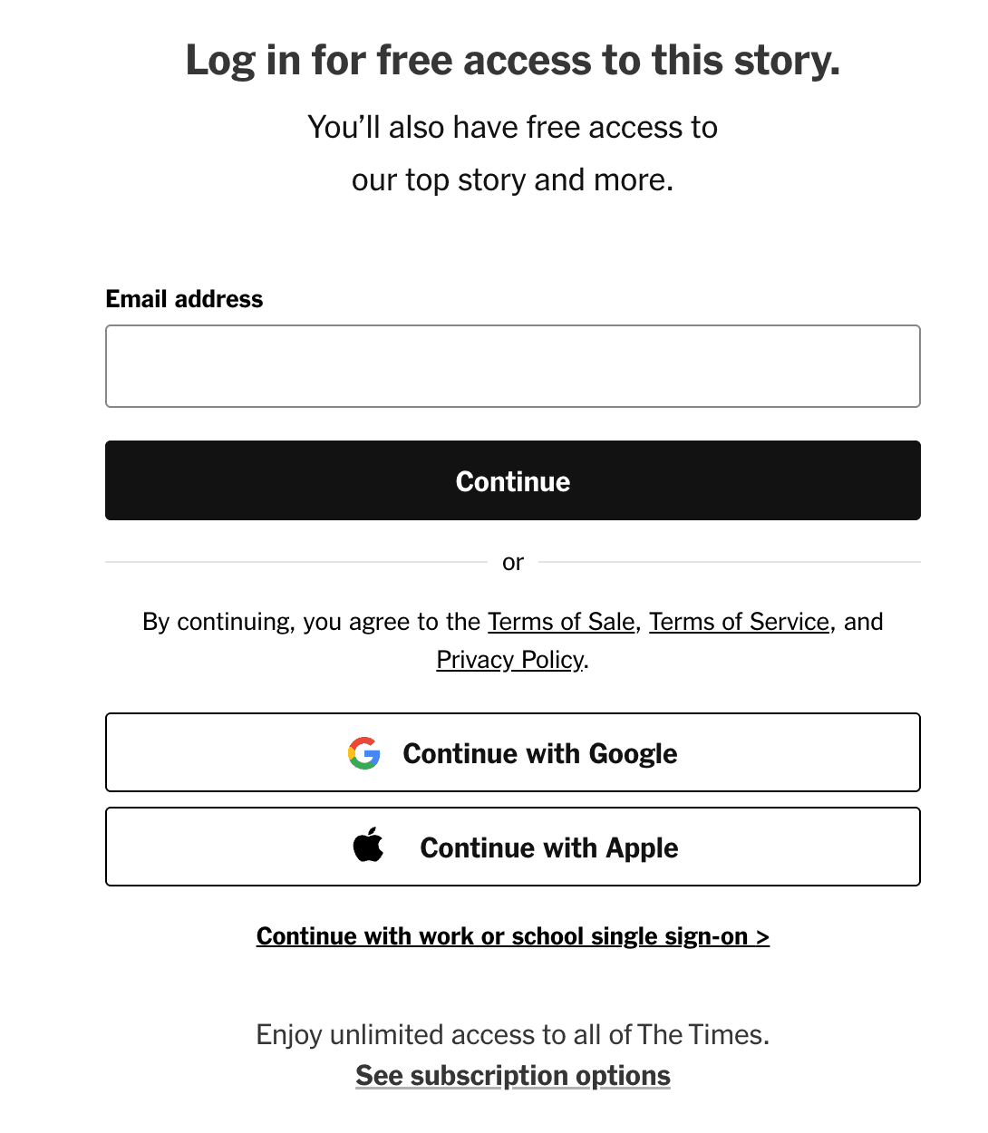
- Fully gated → Everything sits behind the wall. (And yes, you can still make it Google-friendly if you set it up right.)
- Partially gated → Allow 30%, 50%, or even 70% of the content to show (a/b test with those percentages). Often, traffic stays stable while conversions increase.

- Teaser gating → Show just the intro, then block. Tricky for news (since the first paragraph often gives away the story) but excellent for opinion pieces, how-to’s, or deep dives.
- Free trial first → Encourage readers to create an account, build a habit of reading, and then introduce payment.
Your gating strategy sets the tone for the entire experience.
Placement of the Wall
There’s some options for the placement of the wall too:
- In-line → The wall sits right inside the article.
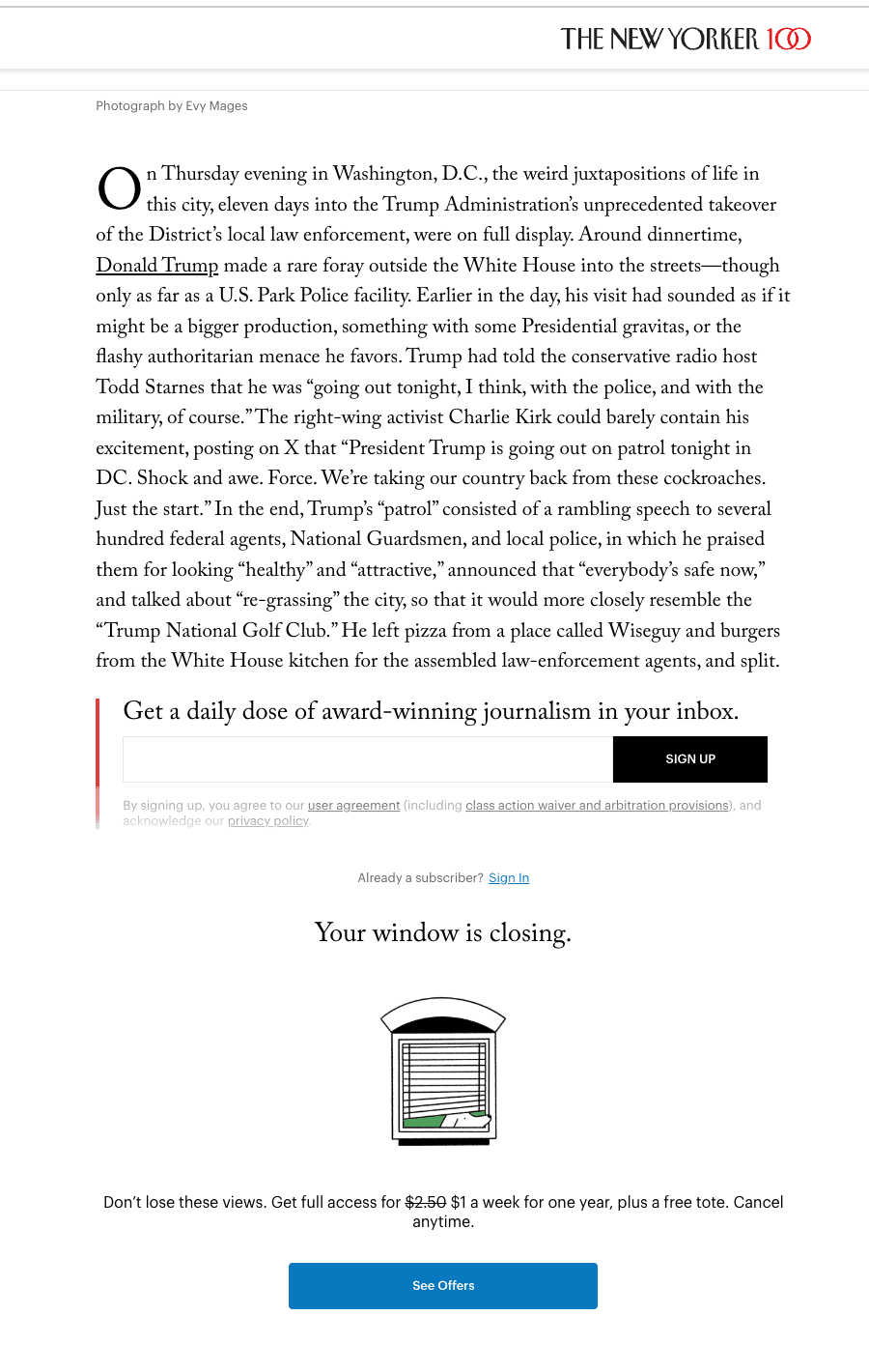
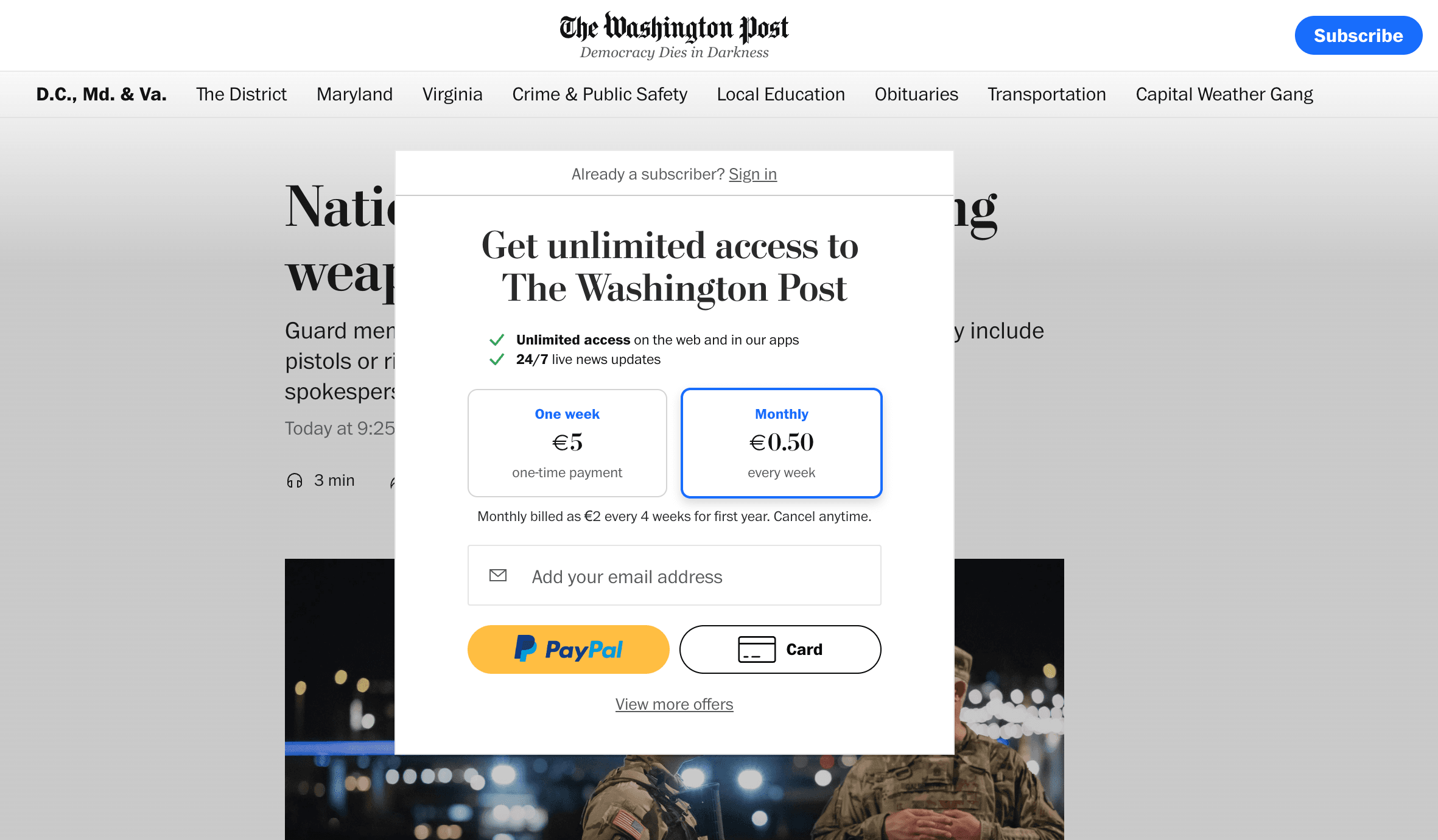
- Popup → Blocks the article with a modal.
- Sticky banner → Slides up from the bottom of the screen

Each option has pros and cons. And yes — you can combine them. (For example: a sticky banner plus a conditional popup.) The only way to know what works best for your audience is to test.
Optimization Opportunities
Once your wall is live, the real work starts: optimization.
Here are some levers you can pull:
- Proposition → Test digital-only plans vs. bundles. Try long vs. short-term subscriptions.
- Discounts → A longer subscription with a bigger discount can nudge AOV up. (But keep in mind: you’ll need a large sample size — at least 30k users per variant — to measure AOV impact properly, since the statistics change to non-binomial data.)
- Secondary pathways → Not everyone’s ready to subscribe, or some might already be customers. Offer options for account holders, newsletter signups, or metered access.
- Inside the wall → Every detail matters: checkout form fields, CTA text, location of the CTA, the tone of voice, even social proof.
Paywalls should be treated like any other funnel. You test, learn, and iterate.

Examples That Inspire
Some publishers are already doing this really well.
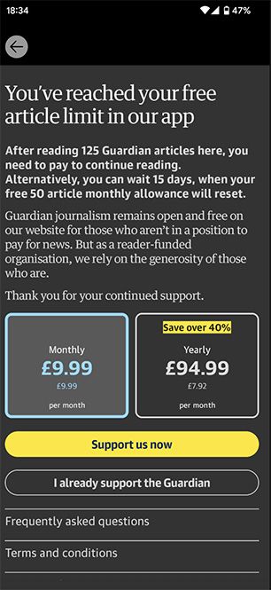
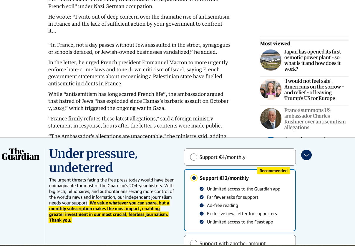
The Guardian → They don’t use a traditional paywall at all. Instead, they lean on their values: protecting free press, holding power to account, providing trustworthy journalism. It’s about fairness: quality journalism isn’t free to produce, and if you value it, support it. That value-driven messaging has been key to their growth.
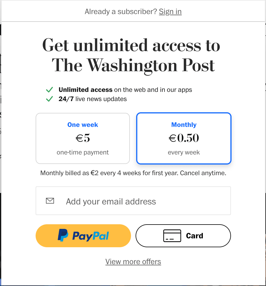
- The Washington Post, Der Spiegel, Ad.nl → All experiment with different gating and placement strategies, tailoring the paywall experience to the reader’s context.


The lesson? There’s no one-size-fits-all. The best results come from matching strategy to audience.

Real A/B Tests That Moved the Needle
Talking about theory is one thing — but nothing beats real-world results. At Increase Conversion Rate, we’ve run dozens of experiments on media paywalls, and three of them stood out for how much they improved performance.
Adding a registration wall after the visitors have read 2 free articles
Hypothesis
When we show a registration wall to visitors after they’ve read 2 free articles, it convinces loyal readers to create an account and log in, as they want to stay informed.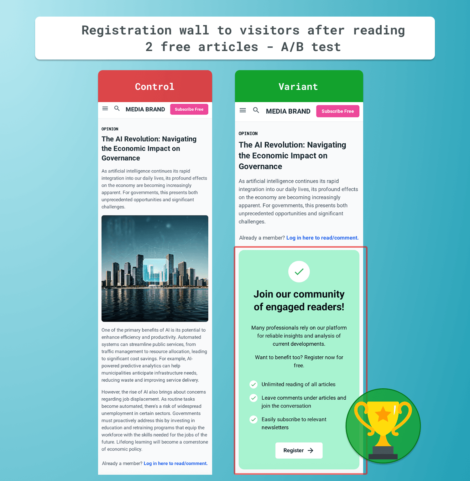
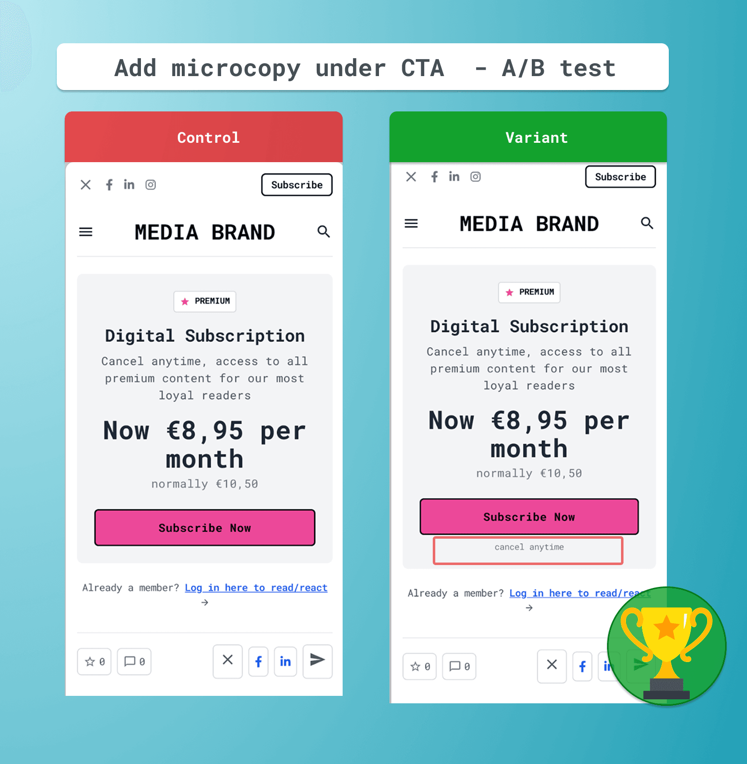
Adding microcopy under the CTA button on a paywall
Hypothesis
When we remove doubts about the subscription, users are more motivated to proceed. We measure this through CTR to the /signup page and completed subscriptions.
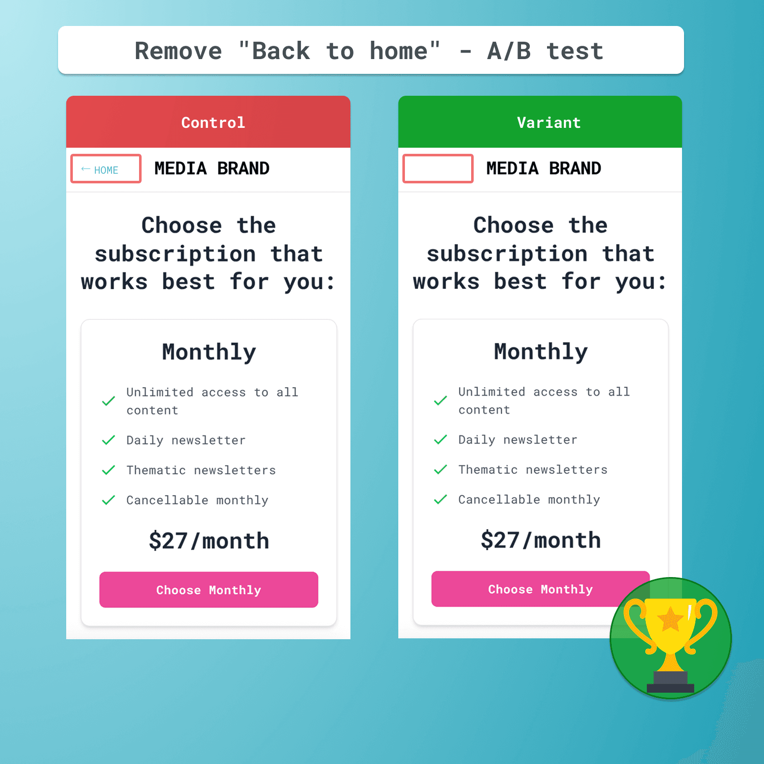
Remove "Back to home" in the signup flow
Hypothesis
When we remove the back button, it reduces user hesitation, which we measure through CTR and conversion rate (CR).
This was a test we had run multiple times, for many funnels. Often a win. Also for this media brand: a win.
Start small, test what works best for your audience, and keep optimizing. Conversion wins often come from simple moves done well.
So next time you're looking for inspiration on what to experiment with, try these proven ideas — or reach out to us for help with A/B testing. They could work just as well for your business.